COVID19 Tracking for US States

This site contains alternate visualizations of the data from the COVID Tracking Project and The New York Times. For reference, Italian data from the Presidenza del Consiglio dei Ministri - Dipartimento della Protezione Civile is also included.
Caveat: Because of testing limitations, these graphs underreport the actual situation. As more testing is performed, some graphs will include large "correcting" jumps. As testing coverage improves, the data presented here will more accurately reflect the actual situation.
Positive Cases Reported in US by County

Deaths Reported in US by County


Positive Cases, Deaths and Tests for each state
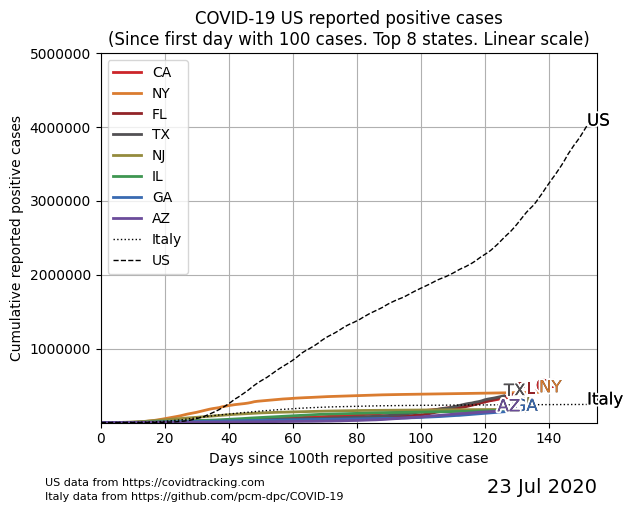
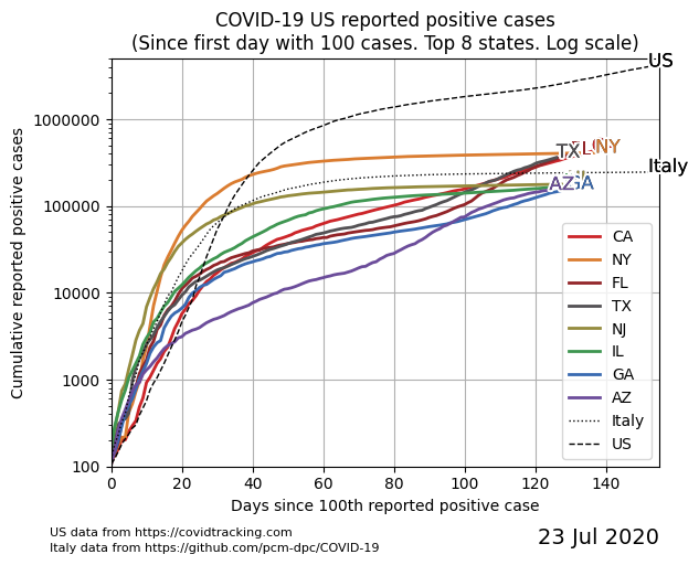
Positive Cases Reported in US
These 2 graphs plot the number of positive cases reported each day for the 8 states that reported the largest number of cases. The origin for each state is the day it first reported 100 positive cases.
The first graph uses a linear scale, while the second uses a log scale. An aggretate total for the entire US and the data for Italy are also included for reference.
See ranking data for all states/territories (reported positive cases).
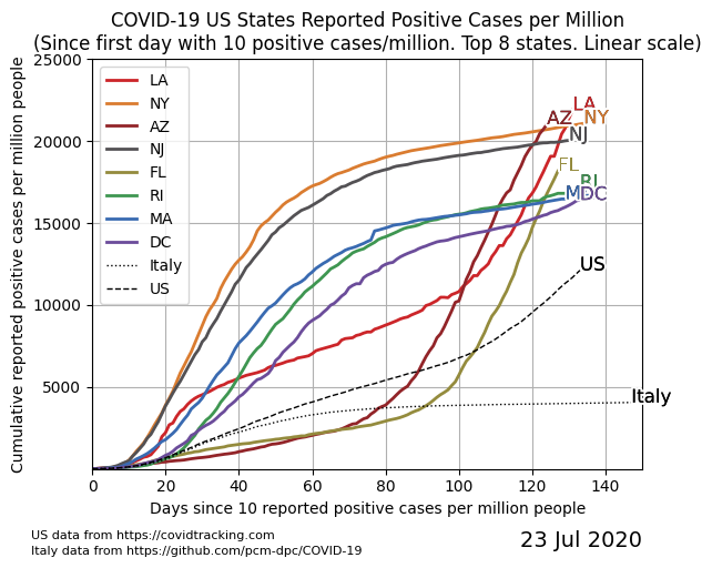
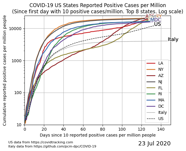
Positive Cases Reported in US - Normalized
These 2 graphs plot the number of positive cases reported each day, normalized for each state based on its population. The "day 0" is based on when the state first reported 10 positive cases per million residents.
See ranking data for all states/territories (reported positive cases, per capita).
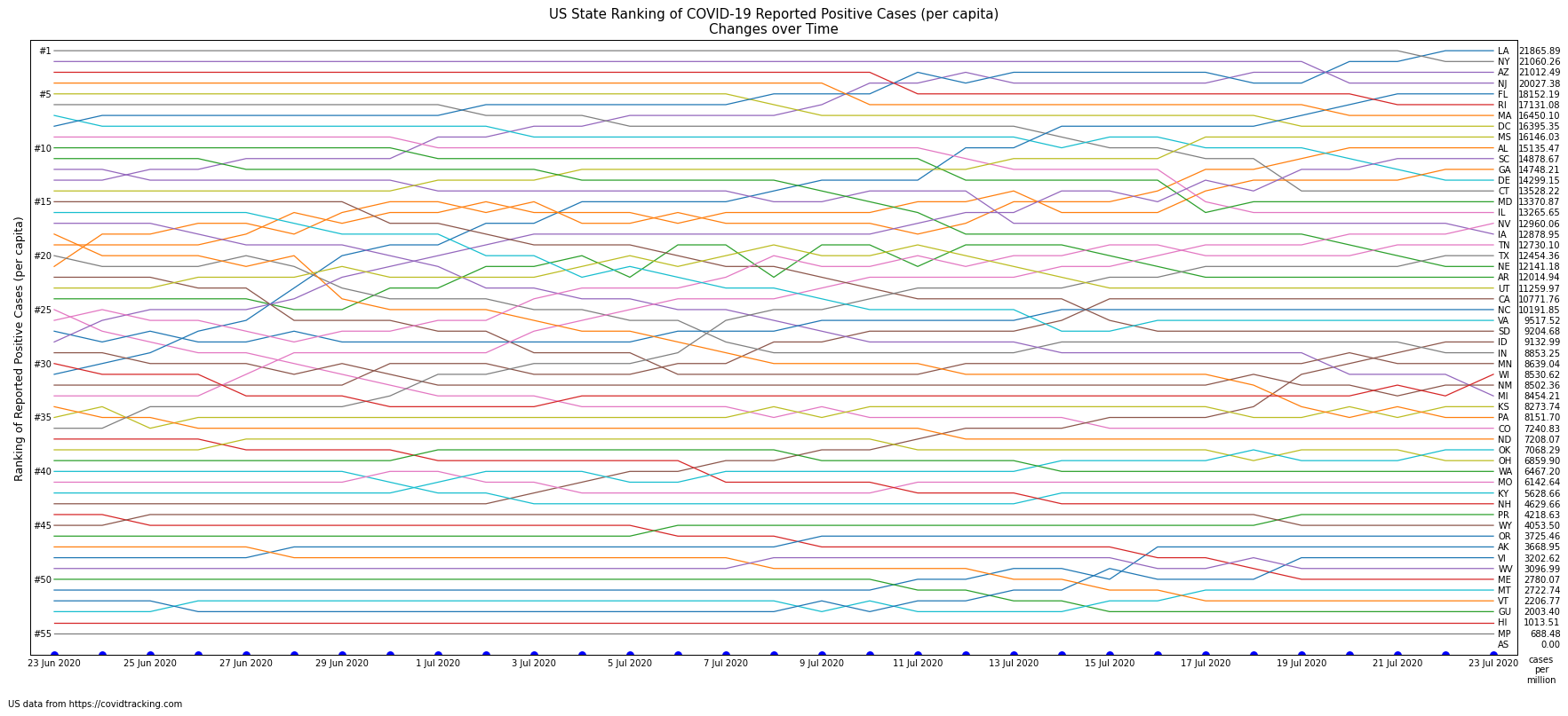
Cases Reported - Change in State Ranking over Time
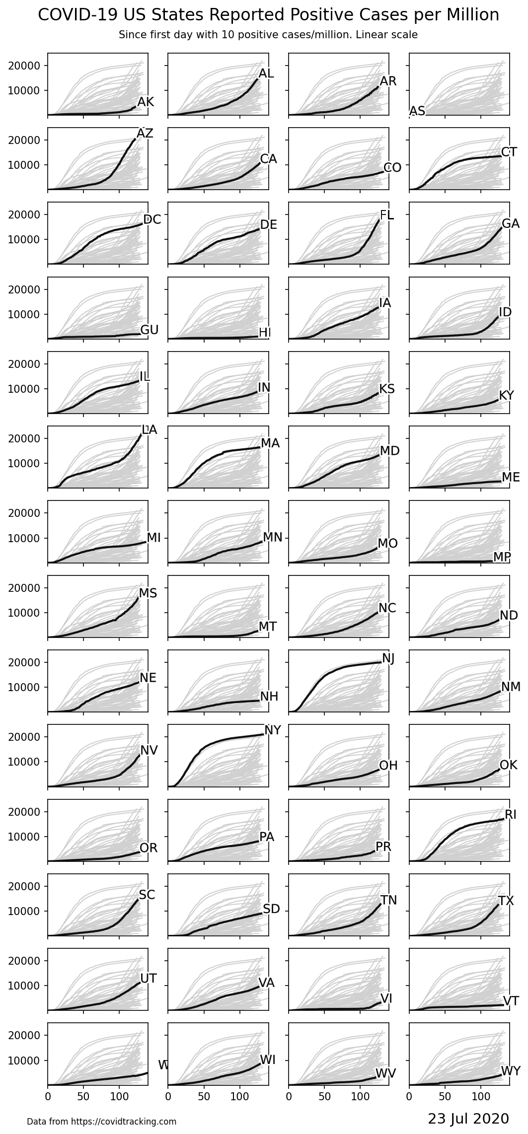
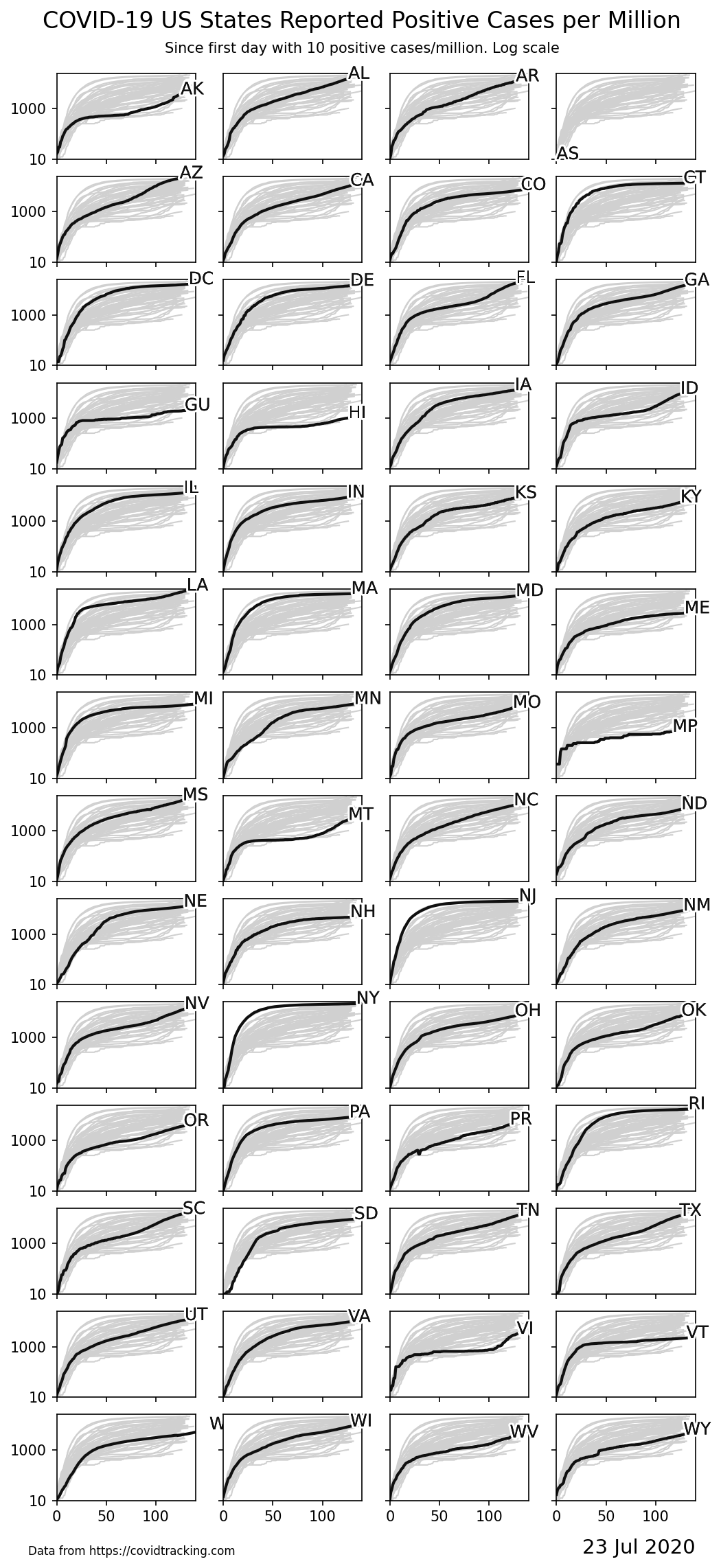
Positive Cases Reported for Individual States
The following graphs shows the normalized data for each state individually. As with the normalized graphs above, "day 0" is when the state first reported 10 positive cases per million residents. Each graph contains the data for all states plotted in the background for reference.
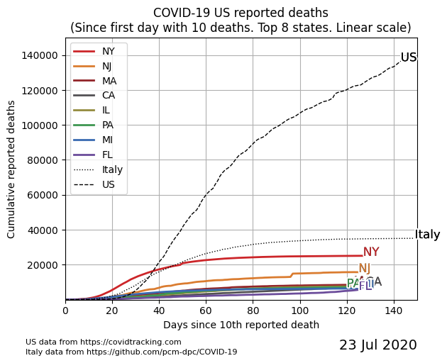
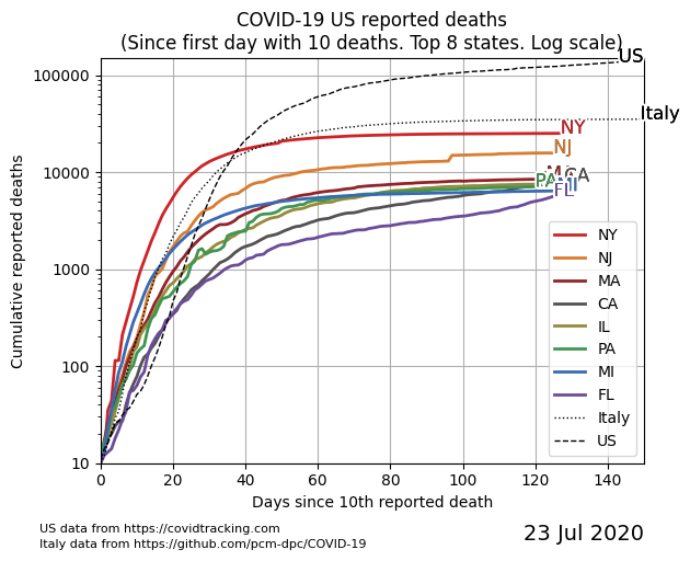
Deaths Reported in US
These 2 graphs plot the number of deaths reported each day for the 8 states that reported the largest number of deaths. The origin for each state is the day it first reported 10 deaths.
The first graph uses a linear scale, while the second uses a log scale. An aggretate total for the entire US and the data for Italy are also included for reference.
See ranking data for all states/territories (reported deaths).
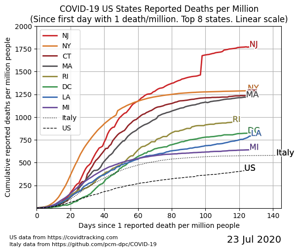
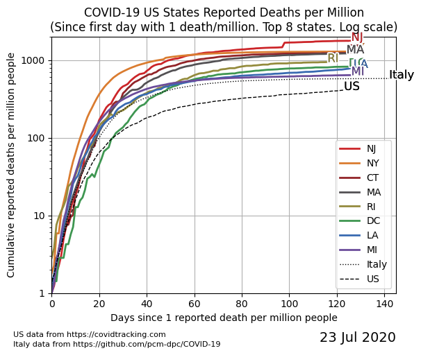
Deaths Reported in US - Normalized
These 2 graphs plot the number of deaths reported each day, normalized for each state based on its population. The "day 0" is based on when the state first reported 1 death per million residents.
See ranking data for all states/territories (reported deaths, per capita).
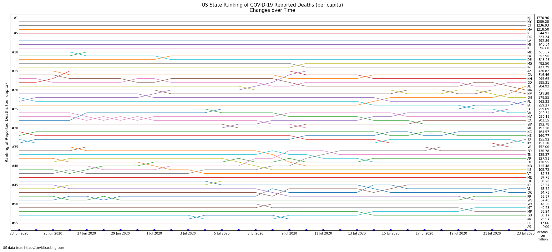
Deaths Reported - Change in State Ranking over Time
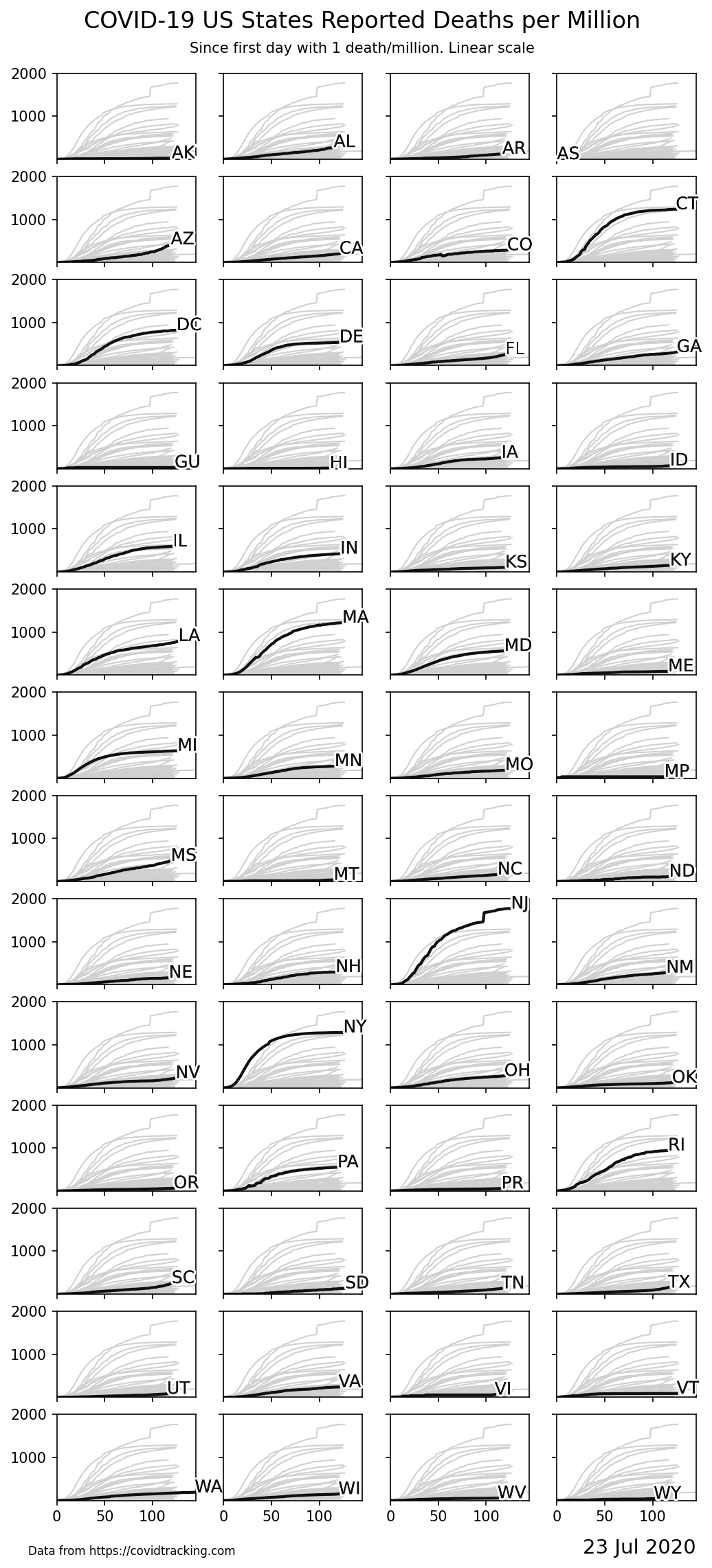
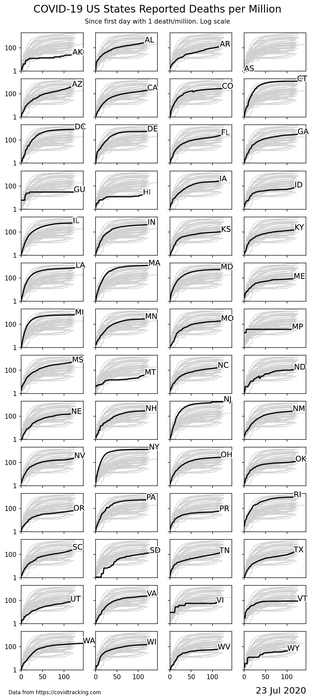
Deaths Reported for Individual States
The following graphs shows the normalized data for each state individually. As with the normalized graphs above, "day 0" is when the state first reported 1 death per million residents. Each graph contains the data for all states plotted in the background for reference.
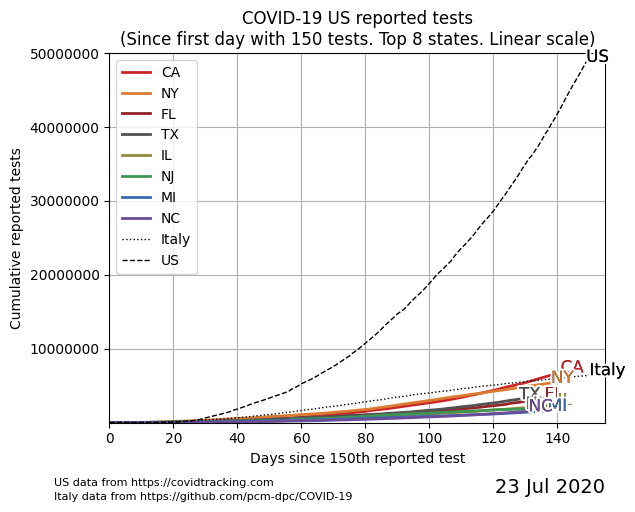
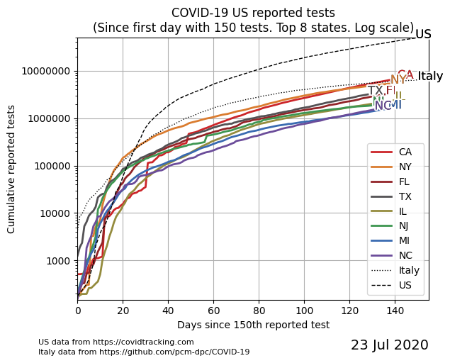
Tests Reported in US
These 2 graphs plot the number of tests reported each day for the 8 states that reported the largest number of tests. The origin for each state is the day it first reported 150 tests.
The first graph uses a linear scale, while the second uses a log scale. An aggretate total for the entire US and the data for Italy are also included for reference.
See ranking data for all states/territories (reported tests).
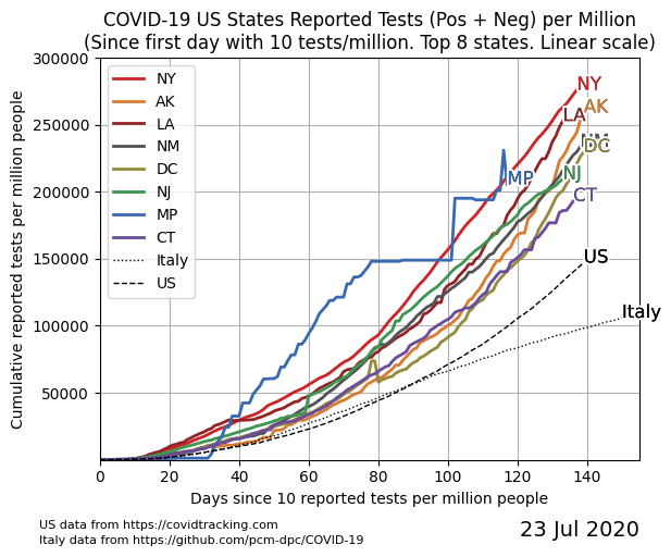
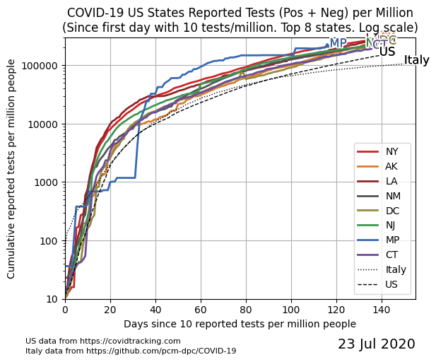
Tests Reported in US - Normalized
These 2 graphs plot the number of tests reported each day, normalized for each state based on its population. The "day 0" is based on when the state first reported 10 tests per million residents.
See ranking data for all states/territories (reported tests, per capita).
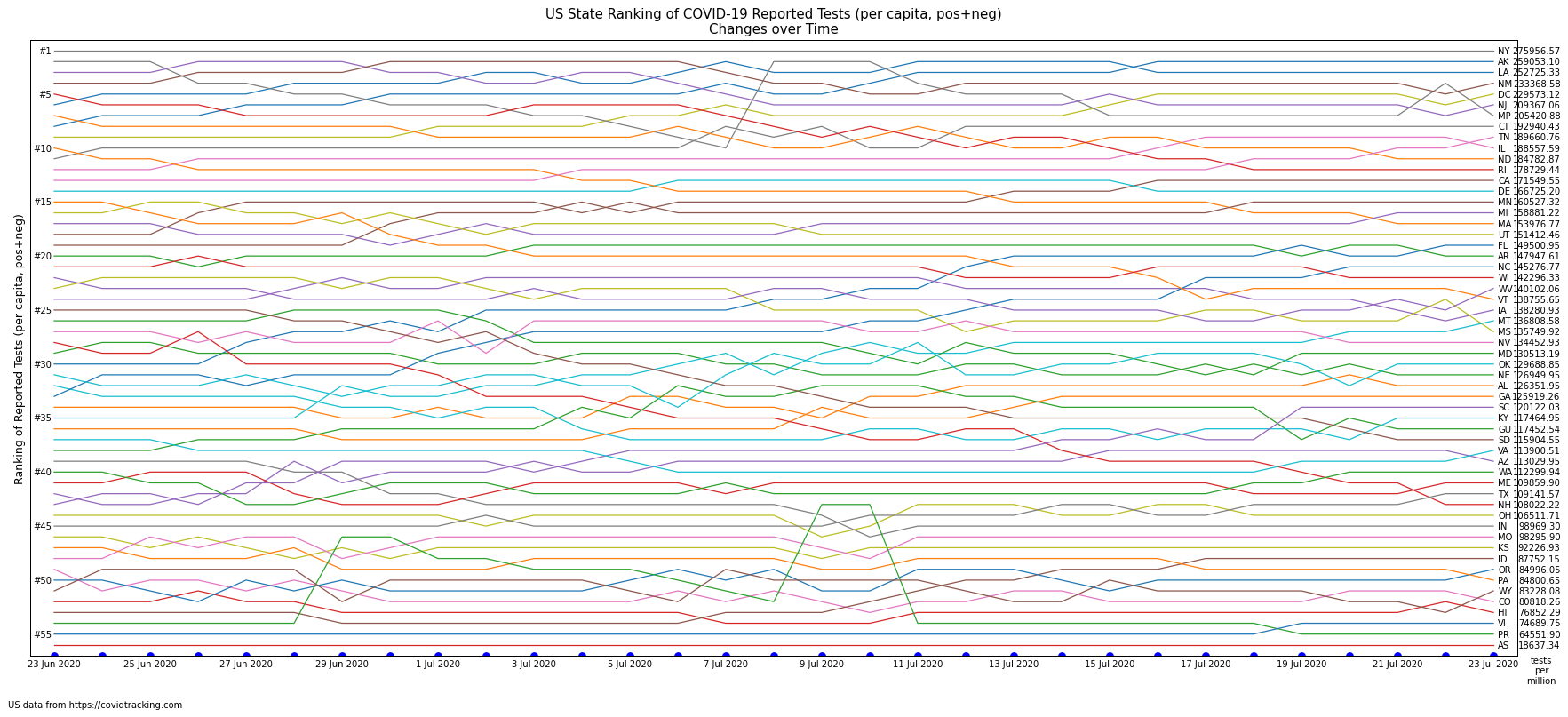
Tests Reported - Change in State Ranking over Time
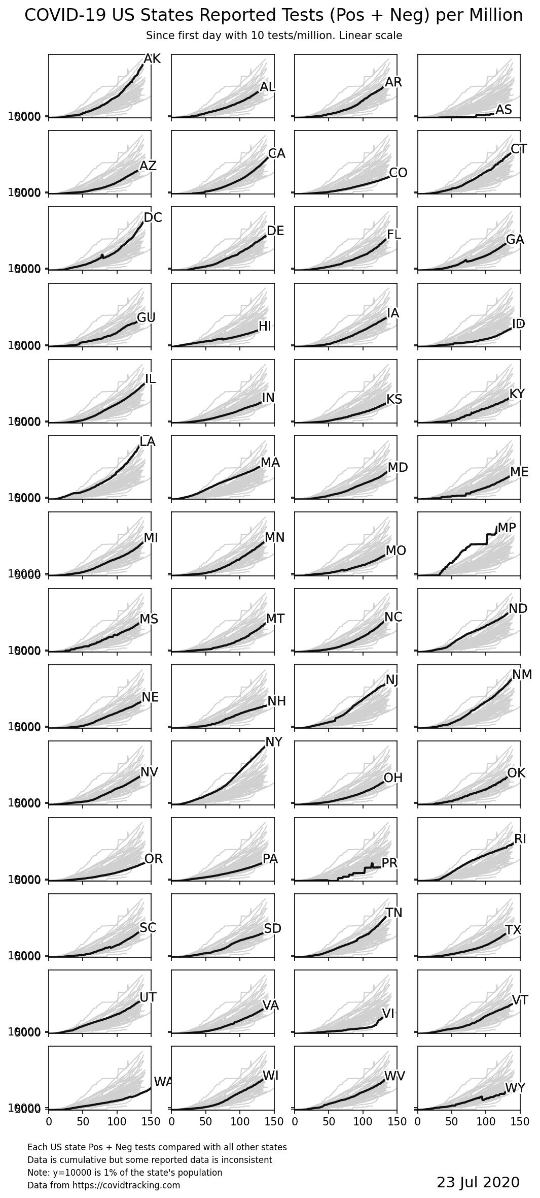
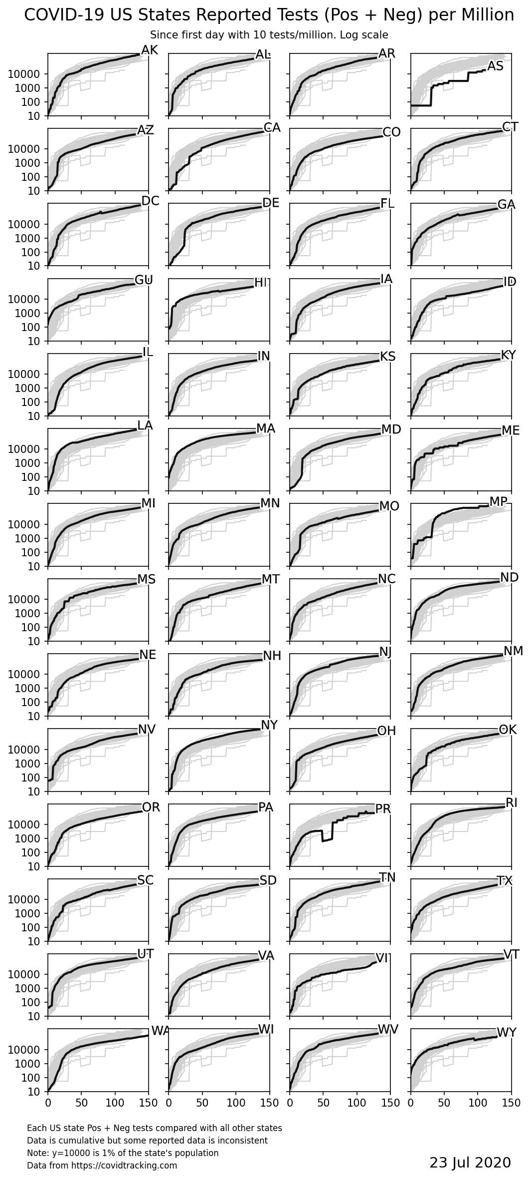
Tests Reported for Individual States
The following graphs shows the normalized data for each state individually. As with the normalized graphs above, "day 0" is when the state first reported 10 tests per million residents. Each graph contains the data for all states plotted in the background for reference.
Info
The approach taken here is similar to the one taken by John Burn-Murdoch's group at the Financial Times where the data for each country is overlaid on the same graph, aligned so that the x-axis origin is the day the country first achieved some reporting milestone ("day 0"). Others, like dev_thetromboneguy on Reddit and Kendrick Hang on Twitter used a similar approach to create aligned tables comparing the US total and Italy.
However, rather than comparing entire countries, the graphs on this site compare and rank different states (and territories) in the US. Both normalized (i.e., adjusted for population) and raw data are shown.
Links and Further Reading
- The Python script that generates these graphs is on github.
Analysis
- 17 Apr 2020 How does coronavirus kill? Clinicians trace a ferocious rampage through the body, from brain to toes
-
13 Apr 2020 A Comic Strip Tour Of The Wild World Of Pandemic Modeling
- Why pandemic modeling is hard and why the predictions vary so much.
-
10 Apr 2020 Deaths in New York City Are More Than Double the Usual Total (NYT)
- These numbers [...] suggest that the current coronavirus death figures understate the real toll of the virus, either because of undercounting of coronavirus deaths, increases in deaths that are normally preventable, or both.
-
4 Apr 2020 Seattle’s Leaders Let Scientists Take the Lead. New York’s Did Not
- The initial coronavirus outbreaks on the East and West Coasts emerged at roughly the same time. But the danger was communicated very differently.
- 29 Mar 2020 Epidemic Modeling 101: Or why your CoVID19 exponential fits are wrong
- 27 Mar 2020 States aren’t testing uniformly for coronavirus. That’s creating a distorted picture of the outbreak
-
26 Mar 2020 «The real death toll for Covid-19 is at least 4 times the official numbers»
- Nembro, one of the municipalities most affected by Covid-19, should have had - under normal conditions - about 35 deaths. 158 people were registered dead this year by the municipal offices. But the number of deaths officially attributed to Covid-19 is 31
-
10 Mar 2020 Tomas Pueyo's analysis in
Coronavirus: Why You Must Act Now
-
Key takeaway:
- 0.5% - 0.9% fatality rate for regions that are prepared and act early
- 3% - 5% fatality rate for regions that are overwhelmed (because of acting late or not being prepared)
-
Key takeaway:
- How to Spot Bad Science about COVID-19
- Paul McNamara: Incubation period for amateur epidemiology appears to be about a week. 😂
Other visualizations
- IHME COVID-19 Projections. Projecting impact on US overall and for individual states. IMHE is the University of Washington's Institute for Health Metrics and Evaluation.
- 1Point3Acres.com has some exellent visualizations of data that they gather for US and Canada.
- The Financial Times' Coronavirus tracked: the latest figures as the pandemic spreads has visualizations for data from various countries around the world.
Personal Accounts
- 1 Jul 2020 Here’s What Recovery From Covid-19 May Look Like for Many Survivors
- 25 Apr 2020 ‘Is this another death I’ll have to pronounce?’
- 12 Apr 2020 The storm inside – How the coronavirus killed Keith Redding
- 9 Apr 2020 I Voted in Person in Wisconsin, And I'm Afraid it Will Get Me Sick With COVID-19
- 24 Mar 2020 “It’s Brutal”: Man Who Tested Positive For COVID-19 Shares The Innocent First Symptoms He Experienced
- 23 Mar 2020 A Day in the Life of an ER Doc - A Brief Dispatch from the #COVID19 Frontline